Before we begin, I use Photoshop CS6 so if you have GIMP some controls, shortcuts will be different. Also, you'll need the PSD template you can find at All the Links.
Well, let's start already.
For this example I'll use Anastsu Kyoushitsu s2, which is included in the Winter 2016 pack.
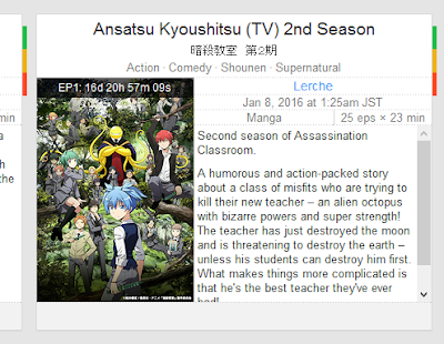 To start, I usually go to Google Images and search for the title. Since this is an upcoming show, I wend directly to livechart.me/winter since it already has an official promo art.
 As a general rule, I try to find a picture where the logo is already present in a good position. Since the icon will be square, you have to remember you'll have to crop the image to make it fit. This one doesn't have the logo, so we will add it in later.
The image we have right now is obviously too small (we're working with 256x256). So we're goin to have to look for a bigger version of the same image. Luckily, big G has the reverse image search we all know and love. So let's do just that.
Now of course we want a big enough version so that all the details are clear. Usually you can just go with the biggest you can find, we'll scale it down later.
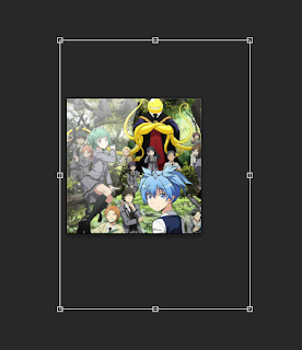 Now paste the picture in Photoshop inside the template psd (open the template now if you hadn't already). Make sure it's the topmost layer under Group 1 or it will hide the border and the glow.
Now as you can see, the pic is a little too big and you can only see Nagisa's cute shota face. We don't want that (or do we?).
So let's scale it down.
I usually just ctrl+T but you can go under edit > transform > scale.
Now we don't want to distort the picture, so hold down shift to keep the aspect ratio, and alt to scale from the center.
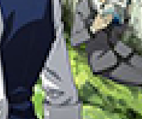
There. Now the picture is all scaled up and ready to go. Right? Not quite.
Se? When you scale an image down, some artifacts and shit like that tend to form. They're barely noticeable if you don't zoom in so you can skip this step if you want.
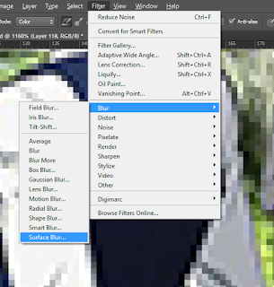
If you do want to clean the pic up a little, here's how I usually do it.
Filter > Blur > Surface Blur
We don't want to smooth it up too much so set radius to 1 and threshold to 5. Of course, play around with the values to see which fit best.
And additional step I take (but not always) is to check and fix the color/tone and contrast. So, yeah, like you see here: Image > Auto Tone/Contrast/ Color. Alternatively you can check ctrl + L to fix the contrast manually and Image > Adjustaments > Vibrance to make the color more, well, vibrant.
In this case this wasn't needed.
 |
| Great, so now the base image is done. Now what? Of course we need to add the logo on top!I usually go to google for this as well, but there are times when it's not easy to find one. |
We go to the source! In this case were going to the official site for the anime.
In many cases the logo you see on the homepage is just a png you can easily save. In other cases you have to go to the source files of the site to scoop out the image, and in other cases you can't really grab anything so be careful.
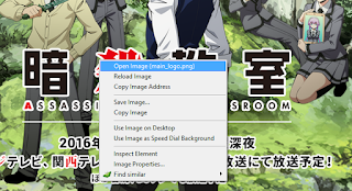
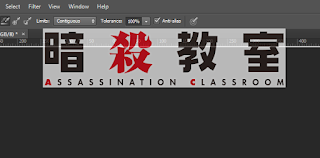 Now we have to paste the picture in Photoshop. Don't try to drag it directly from the browser into the psd file because the Windows clipboard will paste it with a black background and we don't want that. Either save the pic and then drag it from there, or drag it from the browser to Photoshop, but as a new document.
 From here you drag out the tab with the new document containing the logo and drag out the logo itself from the new document to the psd file with the base picture.
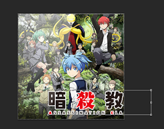
Again, just like we did before, scale and re-position the logo to make it fit nicely.
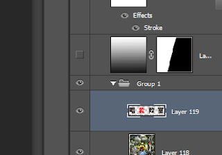 That's it! The icon is ready to be saved. For now we have to save it in png format (there are PS plug ins that let you save in ico but I don't use those).
Of course if you want the [Glowless] version, remember to hide (the icon with the open eye) the layer with the glow before you save.
Now all that's left is to convert this png file to ico. You can easily do that online by going to www.pngtoico.com or similar sites. I prefer to convert a lot of icons at once so I legally acquired IcoFx and use the batch conversion function.
Of course there are times it's not as easy to find usable pictures, or logos, or to make everything fit. But this should be enough for most cases.
That's it. The lesson is over, so raise your hand if you have a question.


I noticed a lot of your newer icons are 32x32 and some of the older ones are 128x128. Why do you suggest using 256x256 for the icons here and what do the different resolutions actually change for .ico files? (If 32x32 doesn't affect the quality and is better, how do you compress it so cleanly?)
ReplyDelete